Designing Four Apps That Feel Like One: UX Decisions Behind a Multi-Role Food Supply Chain Platform
How do you design admin, shopper, producer and delivery apps that share one data model without sharing one interface? A look at the UX decisions, conflicting priorities and shared vocabulary behind a multi-role short food supply chain platform.
Why a short food supply chain needs four interfaces, not one dashboard
A short food supply chain has four roles with almost no overlapping tasks. An administrator curates a catalogue and closes order windows, a shopper browses and buys, a producer picks and packs, a driver delivers. One shared dashboard would force each role to navigate around three sets of controls they never touch, so the platform splits into four apps over one data model.
The temptation with multi-sided platforms is to build a single responsive web app and hide irrelevant features behind permissions. That works when roles differ by seniority, like a manager who sees everything a clerk sees plus reports. It breaks when roles differ by context. A producer weighing courgettes in a barn at 6am and a shopper choosing a delivery slot on a sofa are not doing variations of the same job. They need different information density, different input methods and different failure states.
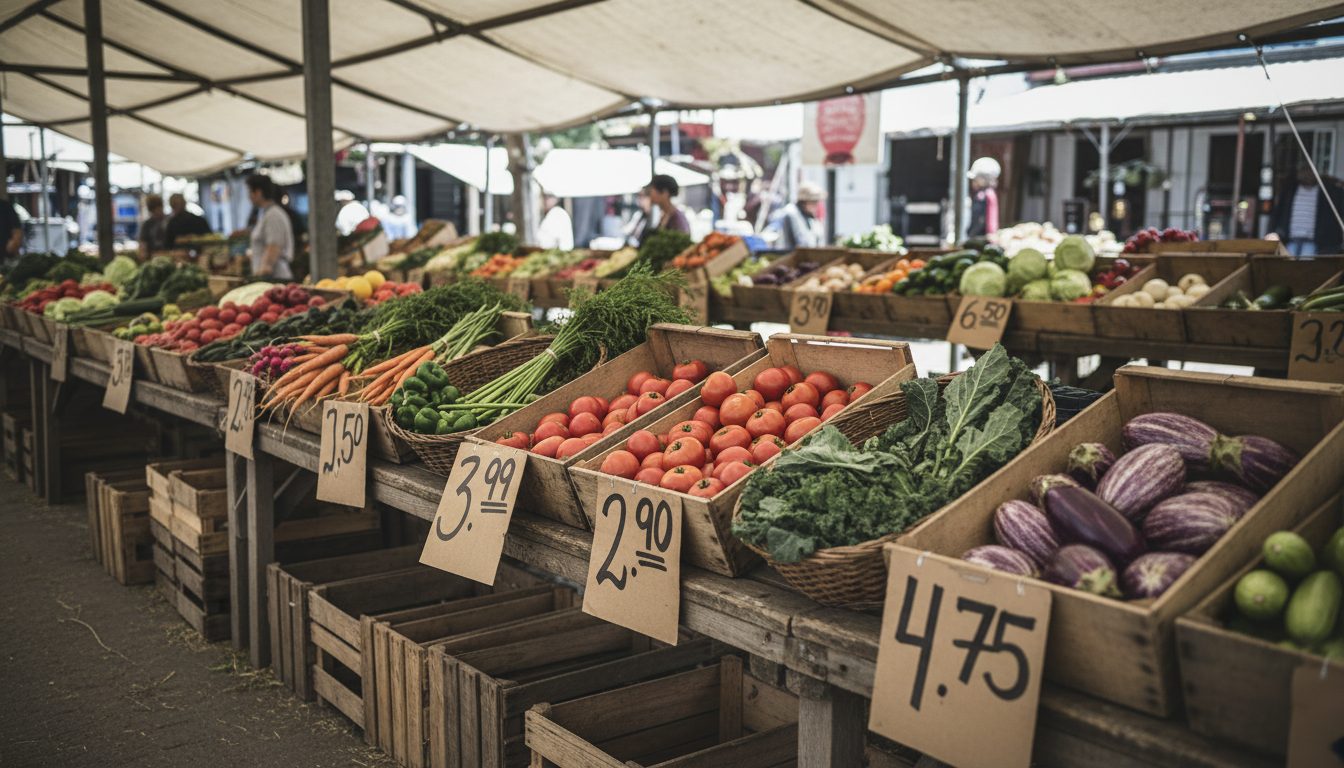
Splitting by context also lets each app follow the conventions of its own environment. The shopper app borrows from e-commerce because that is what shoppers already know. The producer app borrows from warehouse picking tools. The delivery app borrows from courier apps. Nobody has to learn a house style invented for the sake of consistency.
The shared vocabulary layer: one order, four vocabularies
Cohesion between role-specific apps comes from a shared domain model, not shared screens. Every app refers to the same order, the same product, the same delivery window and the same producer record. What changes is the label, the level of detail and which fields are editable. The underlying identifiers never change, so a support conversation across roles stays coherent.
In practice this means agreeing early on what an order actually is. On a marketplace with several producers, a shopper's single basket becomes several producer sub-orders and one or more delivery routes. If the shopper app treats that as one order, the producer app treats its slice as one order, and the delivery app treats a whole van run as one job, then support staff and users end up arguing about which number is the real one. The fix is naming each level explicitly and using that name everywhere: basket, producer order, delivery stop, route.
The same discipline applies to status. A producer marking an item as packed, an administrator confirming a pickup and a driver marking a stop as delivered are all writing to the same status timeline. Each app shows only the transitions its user can trigger, but the sequence is identical underneath, which is what makes an order traceable end to end without reconciliation work.
- Basket: what the shopper builds and pays for, spanning multiple producers
- Producer order: the slice of a basket one producer must pick and pack
- Collection or drop-off: the handover point between producer and logistics
- Delivery stop: one shopper address on a route, with a time window
- Route: the sequence of stops a driver works through in one run
Resolving conflicting needs between roles
Multi-role platforms hit real conflicts where one role's convenience is another's cost. Shoppers want to order late and change orders freely. Producers want early cutoffs so they can harvest and pack once. Administrators want predictability. The design job is to expose the trade-off in the interface rather than pick a winner and hide the consequences.
Order cutoffs are the classic example. Rather than a fixed global deadline, the platform can let administrators configure a cutoff per delivery cycle and then make the consequences visible in every app: the shopper sees a countdown and a clear message about when the window closes, the producer sees a locked, final pick list at the moment the window closes, and the administrator sees how much revenue sits in unconfirmed baskets before the lock. Nobody is surprised by a rule they cannot see.
Substitutions and shortfalls are the second recurring conflict. A producer who harvests less than expected needs a fast way to reduce a line item, but that change propagates to a shopper's paid basket and possibly to a route's load. The design pattern that works is to make the producer's action a proposal with an immediate, honest consequence shown on their own screen, for example a plain statement that reducing this quantity will refund the shopper's line and notify them. The producer sees the downstream effect before confirming, which is what keeps trust intact across the chain.
Role-specific interface patterns that actually get used in the field
Each role's environment dictates its interface pattern. Shoppers get browsing and reassurance, producers get dense lists and large tap targets, drivers get one-task-at-a-time screens usable with one hand, administrators get tables, filters and bulk actions. Designing each app for its physical context matters more than visual consistency across the four.
For producers, the packing screen is the whole product. It should be sortable by the order in which items are physically stored, keep totals per product visible so a producer can harvest once for all customers rather than order by order, and work offline or on a weak signal because barns and fields rarely have good coverage. Confirmations should be one tap with an undo, not a modal asking whether you are sure.
For drivers, the priority is minimising decisions while moving. A route screen that shows the next stop, the address, the customer's delivery note and a call button covers most of the job. Proof of delivery should be a photo or a single tap, and anything requiring typing belongs at the end of the run, not at the door. For administrators, the opposite is true: they work seated with a keyboard, so keyboard shortcuts, multi-select, exportable tables and edit-in-place beat any wizard.
- Shopper: familiar e-commerce patterns, transparent delivery windows, clear producer attribution
- Producer: aggregated pick lists, offline tolerance, large touch targets, one-tap confirmations with undo
- Driver: sequential single-task screens, tap-to-navigate, lightweight proof of delivery
- Administrator: dense tables, filters, bulk edits, exports and audit trails
Keeping four apps consistent as the product evolves
Consistency across four apps is maintained through shared components, a single source of truth for status and copy, and a rule that no role-specific feature ships without checking its effect on the other three. Consistency here means predictable behaviour and matching terminology, not identical layouts.
A shared design system covers the primitives that genuinely repeat: product cards, quantity and unit inputs, date and delivery window pickers, status badges, empty states and error messages. Units are worth special attention in food. Selling by piece, by weight and by variable weight are three different interaction models, and if the shopper app, producer app and admin app each solve them separately, they will drift within a release or two.
The other guardrail is workflow review. Before shipping a change, walk one order through all four apps and check where the change lands. Adding a shopper-facing note field means a producer has to see it while packing and a driver has to see it at the door, otherwise the feature is a promise the platform cannot keep. Most cohesion failures in multi-role platforms are not visual, they are broken hand-offs between roles that each looked fine in isolation.
How this plays out in a real short food supply chain
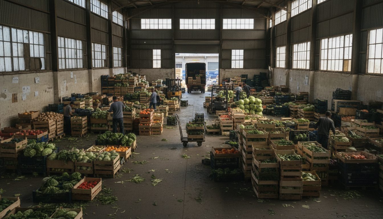
In a working short food supply chain, the test of the design is a single ordinary week: baskets placed, a cutoff closing, producers packing, a driver running a route, an administrator handling one shortfall and one missed delivery. If each of those steps happens in the app built for it and the order history reads as one continuous story, the four apps are functioning as one platform.
Running a marketplace yourself is what surfaces the details no requirements document contains: that producers prefer to pack by product rather than by customer, that shoppers ask about delivery windows more than about prices, that drivers need the buzzer code more than the postcode. Plodie's design decisions come out of operating Plodovi.hr alongside building the software, which is why the four apps are shaped around field realities rather than an abstract role matrix.
Key Takeaways
- Split apps by user context, not by permission level: a producer packing in a field and a shopper browsing at home are not doing variations of the same job.
- Cohesion comes from a shared domain model and shared vocabulary (basket, producer order, delivery stop, route), not from identical screens.
- Where roles conflict, such as late orders versus early cutoffs, make the trade-off visible in every interface instead of silently favouring one role.
- Match each interface to its physical environment: offline-tolerant pick lists for producers, one-hand sequential screens for drivers, dense tables and bulk actions for administrators.
- Before shipping any change, walk a single order through all four apps to catch broken hand-offs, which cause most multi-role cohesion failures.
For the role-by-role breakdown of what each app does and how an order moves between them, see One Platform, Four Apps, which this article builds on from the design side.
Frequently Asked Questions
Should a multi-sided marketplace build separate apps or one app with role-based permissions?
Build one app with permissions when roles differ mainly by seniority and see overlapping data, such as a clerk and a manager. Build separate apps when roles differ by context, device and physical environment, as with a farmer packing in a barn versus a shopper browsing at home. The deciding question is whether the roles share tasks, not whether they share data.
How do you keep terminology consistent across apps for different user roles?
Maintain a single glossary of domain terms tied to your data model, and treat interface copy as part of the shared design system rather than something each app writes on its own. Where a role genuinely needs a different label, map it explicitly to the canonical term so support staff and logs can translate between them. Ambiguity around the word "order" is the most common failure in marketplace platforms.
What does a producer app need that a generic inventory app does not?
Producer apps in short food supply chains need aggregated pick lists across customers, support for variable-weight items, tolerance for poor connectivity in fields and packing sheds, and a fast way to report shortfalls that automatically handles refunds and shopper notifications. Generic inventory tools assume stable stock counts and reliable network access, neither of which holds on a farm during harvest.
How should a delivery driver app handle failed deliveries in a food supply chain?
It should let a driver record a failure in one or two taps with a preset reason, capture a photo where relevant, and immediately notify the administrator and shopper so perishable goods can be redirected or rescheduled the same day. Because fresh food cannot sit in a van overnight, failed delivery handling should be designed as a same-day workflow, not an exception logged for later review.
How do you test UX for a platform with four different user types?
Test workflows end to end rather than screen by screen. Run a real order through all four roles in one session, ideally with actual producers and drivers in their own environments rather than in an office, and note every hand-off where information is lost or has to be repeated by phone. Phone calls between roles are the clearest signal of a design gap.